![]()
When I was branching off into my company, my logo was the first item to tackle. I wanted my logo to reflect my style of work, my style of design and have a hidden meaning as so many famous brands do. Your logo will be the foundation of your branding. If you are a novice at design, there are a few options available. Also included in this article are famous logos with some amazing style and catchy hidden meaning. (The hidden meaning will be revealed at the end of the article. Now now, don’t go scrolling down to the bottom.)

Your Budget
My audience is mostly small to mid-sized businesses so most of you will not be running off to hire a brand agency. Which means that you have to decide your style and your skill set. You also have to decide how you want to make a name for yourself. I wrote another article (Click Here) that addresses choosing a name for your business and, often, the name/logo choices go together. Start with your best process for making decisions. Do you do tons of research? Do you doodle out what appeals to you? Are you able to sift through 100 designs and narrow it down to one or do you start from the ground up? Whatever is your best approach, you will need to do some legwork before you reach out for help.
Company
I had the amazing pleasure of finding my graphic designer at a women’s conference called Spark and Hustle. I do love dabbling, but I also know where I should spend my time and this definitely wasn’t in my wheelhouse. Much like when I had to make some critical decisions in my own house that could be costly if I messed them up. I’m sure there are more than a few graphic artists in the neighborhood and you’ve admired their work. Look around at your local shops. See who has a catchy logo and ask for a recommendation. Look at companies in your association or go to a trade show for small businesses. You are sure to find someone(s) who would be a great start. Look on Yelp or Google Reviews to confirm the company has a great reputation.
Contractor
Scoping out online coops that give a plethora of services may be better for your budget. There are also independent agencies that you can explore. I look on Etsy.com for a lot of people providing artistry. Fiverr.com is made up of independent contractors who will offer all types of graphic, video or other cool digital products. And there is always the ever popular vistaprint.com.
I’d love to hear from you about your experience with contractors in the online space. (Please leave a comment)
Apps
One of my clients wanted to start a business and asked me to make him a logo. I laughed in his face, but he insisted that I could do it. (Damn, these clients want everything) So, I searched around and found Canva.com to create a design. I started with the colors that he liked and the name of his company and pulled in some Word Art and VOILA, a logo was born. There are an amazing array of mobile and web apps available, including Logo Maker Shop, Makr and 99designs. Start with some basic principles. Color, shapes, letters and concepts that reflect your style of business. My green and grey colors, simply put, are what I’m attracted to.
Did you guess correctly?
So, here are the subtle things that were incorporated in this blog’s logos:
Technology In A Box: The word “Technology” is housed within a design of boxes
Amazon: There is an arrow that connects two letters under the word Amazon (that name screams power). But the implied message is that they can ship anything from A to Z
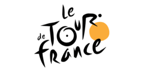
Le Tour de France: If you didn’t spot it, there is actually a biker hidden in the “R” sitting on his seat, the “U”, and his wheels are the “O” of Tour” and the other is a Sun, which signifies that the race is only during the day
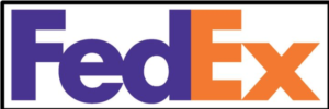
FedEx: So recognizable with all of those trucks flooding our streets. But the hidden uniqueness is in the Ex. Notice between the “E” and the “X” is a white space that outlines an arrow. Yes, move those packages forward!
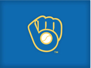
Milwaukee Brewers: Not only does it look like a catcher’s mitt, but the fingers of the mitt provide the “M” and the thumb and ball provide the “B”
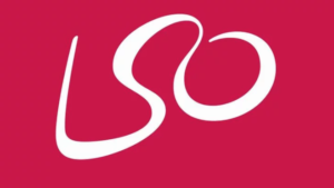
London Symphony Orchestra: An elegant flow as the bottom of the L is the start to the S which pours into the O. True fans also know that the design’s imagery evokes the scene of a conductor, with the head and arms waving about as they lead the orchestra!
All food for thought. I’d love to hear your journey on the quest for a logo!